John Howard Society ⚖️
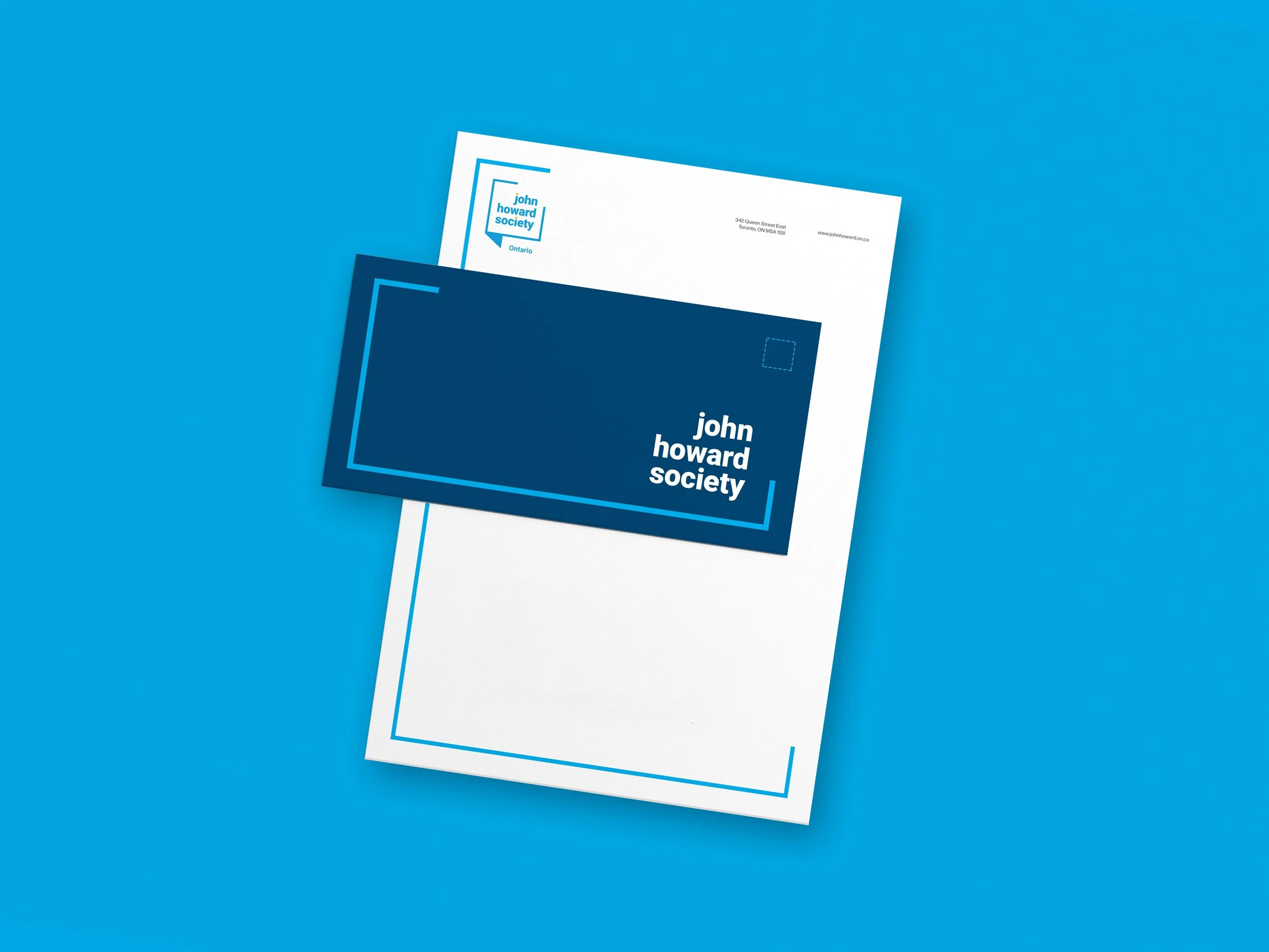
The John Howard Society of Ontario faced the challenge of uniting multiple offices under a cohesive brand identity. Tasked with refreshing their brand, we designed a new logo, developed comprehensive branding guidelines, and created administrative templates to ensure consistency across all locations. By providing accessible tools and clear standards, we helped the organization build a unified and professional presence across the province.
Work
Brand refresh, asset development,
Roles
Lead graphic designer
Year
2019
Logo Development
Designing the new logo for the John Howard Society of Ontario was an exciting and meaningful challenge. The goal was to create a logo that reflected the organization’s commitment to opening conversations around social justice while ensuring multiple municipalities could quickly adopt it. We refreshed the colour palette to establish a modern and distinct brand identity that stood out while maintaining the integrity of the organization’s mission. To address the issue of inconsistent branding across other John Howard Society locations, we provided each office with tailored variations of the logo and accompanying assets, ensuring a cohesive yet flexible identity for all.
Designed Elements
To further solidify the refreshed brand identity, we designed and produced various administrative and outreach materials, including business cards, letterheads, banners, and brochures. I developed, organized, and uploaded all assets to the John Howard SocSociety'srver, ensuring easy access and seamless implementation across all offices. By extending the design to these materials, we established a cohesive and professional brand image that accurately reflected the organization's values and mission.


